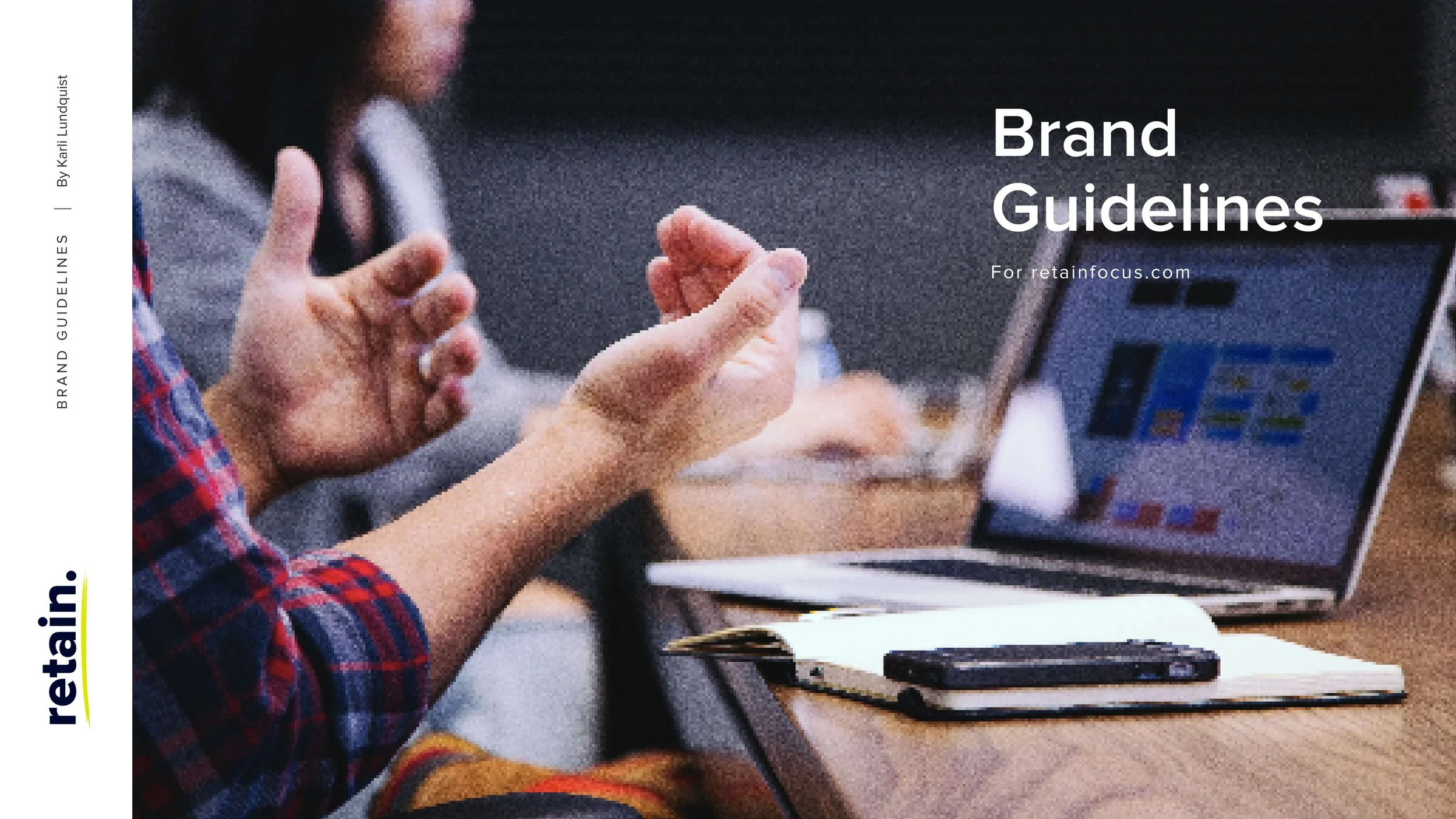
Retain. Brand Identity
Retain. | 2022-23 | Art Director + Designer
I was tasked with creating the foundational brand identity for Retain., a startup SaaS company specializing in retention tools for businesses. The goal was to craft a visual identity that not only differentiates Retain. from competitors but also communicates its human-centered approach in an industry often dominated by cold, tech-heavy aesthetics.
BRIEF
Retain. is a startup SaaS company dedicated to providing tools that help businesses improve retention. The challenge is to develop a visual language that feels fresh, human-centered, and approachable, while still aligning with the modern, professional aesthetic expected in the SaaS industry.
Project Goal
Establish a unique, recognizable brand identity for Retain. that stands out in the competitive SaaS landscape.
Communicate the company’s focus on human connection and retention through thoughtful design choices.
Ensure the brand feels fresh and modern while remaining relatable and professional within the tech space.
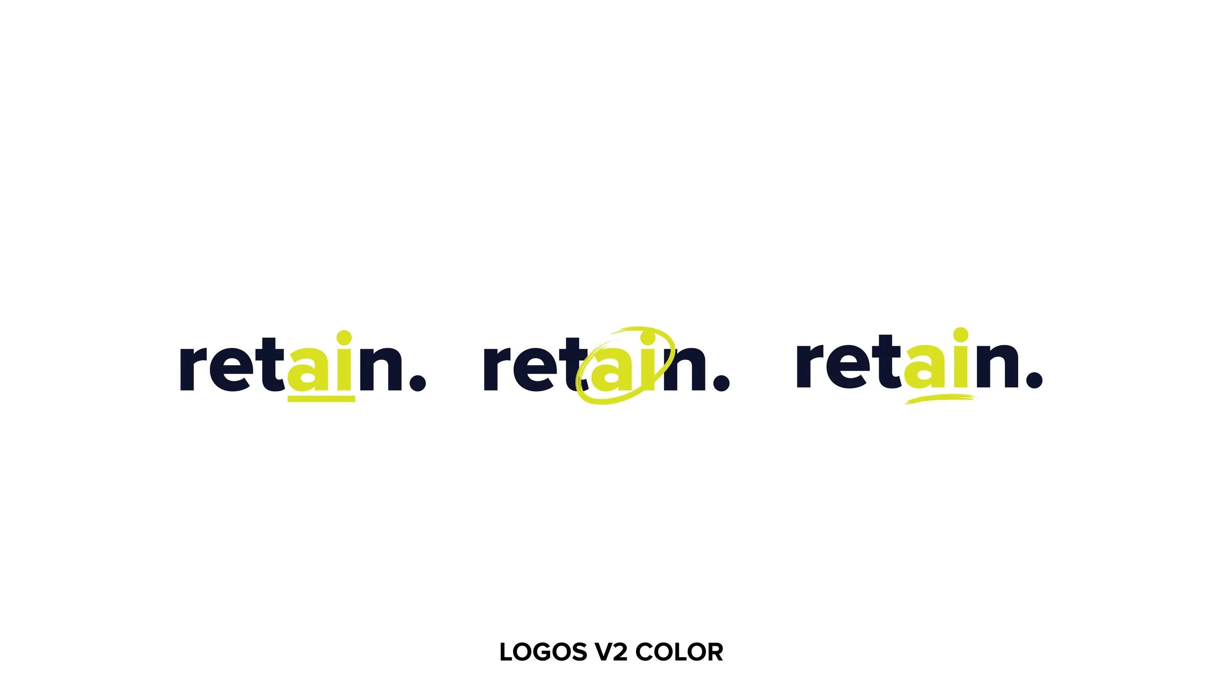
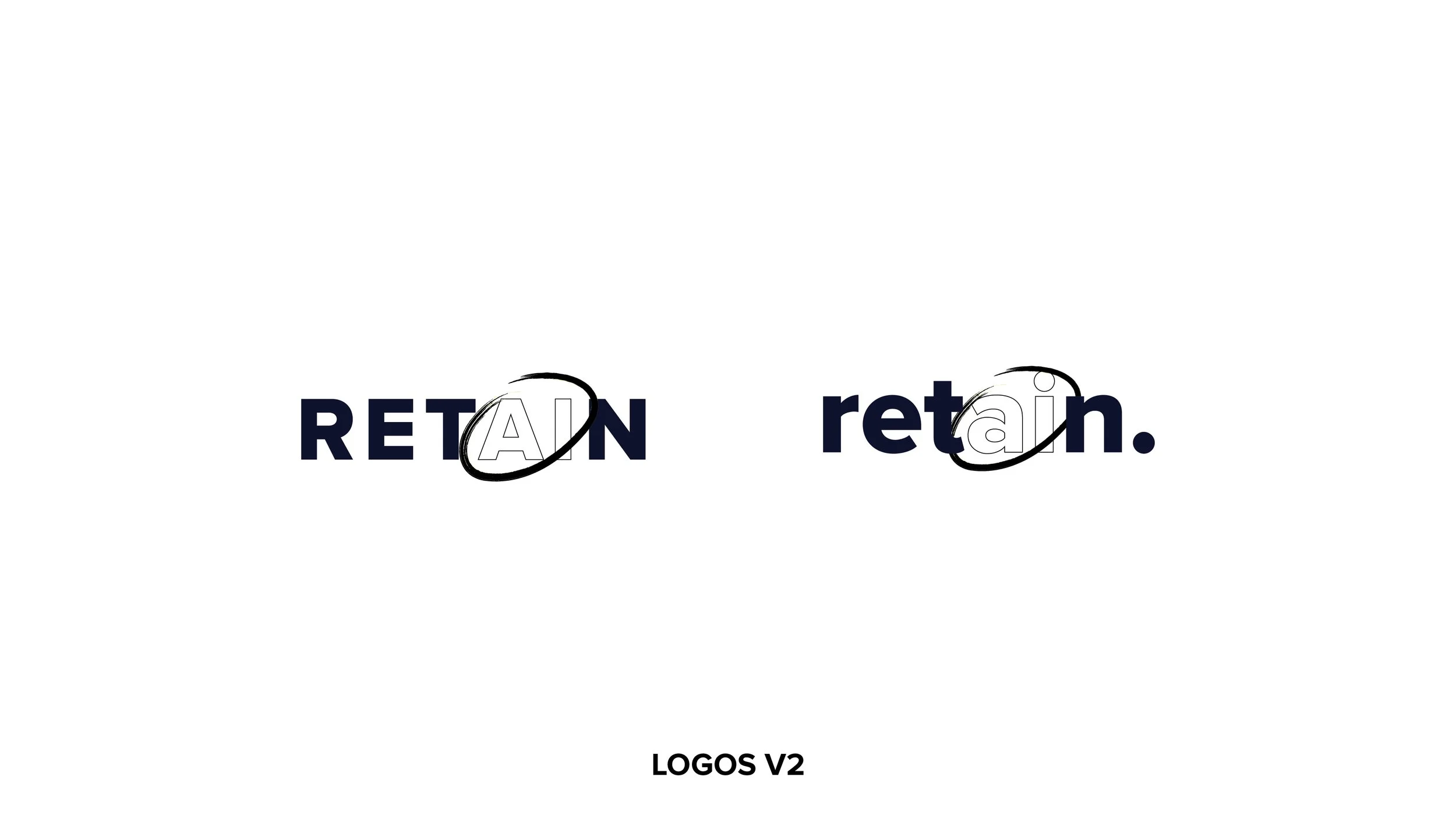
Logo Progression


Pain Points
Differentiation: The SaaS industry is filled with brands utilizing geometric, tech-heavy designs. How could we break through the noise without becoming alienating?
01.
Approachability: Many tech brands struggle to feel accessible. Retain. needed to stand out as approachable while maintaining credibility in a professional space.
02.
Communicating Purpose: How can we ensure the platform’s name effectively conveys its purpose, helping potential users immediately understand what the software does? Additionally, should we highlight our AI-driven capabilities within the name to emphasize innovation and align with market trends?
03.

FINAL DESIGN
The design process began with in-depth research into SaaS competitors, examining their visual identities, tone, and positioning. This informed our strategy to infuse warmth and humanity into the Retain. branding to better connect with potential clients.
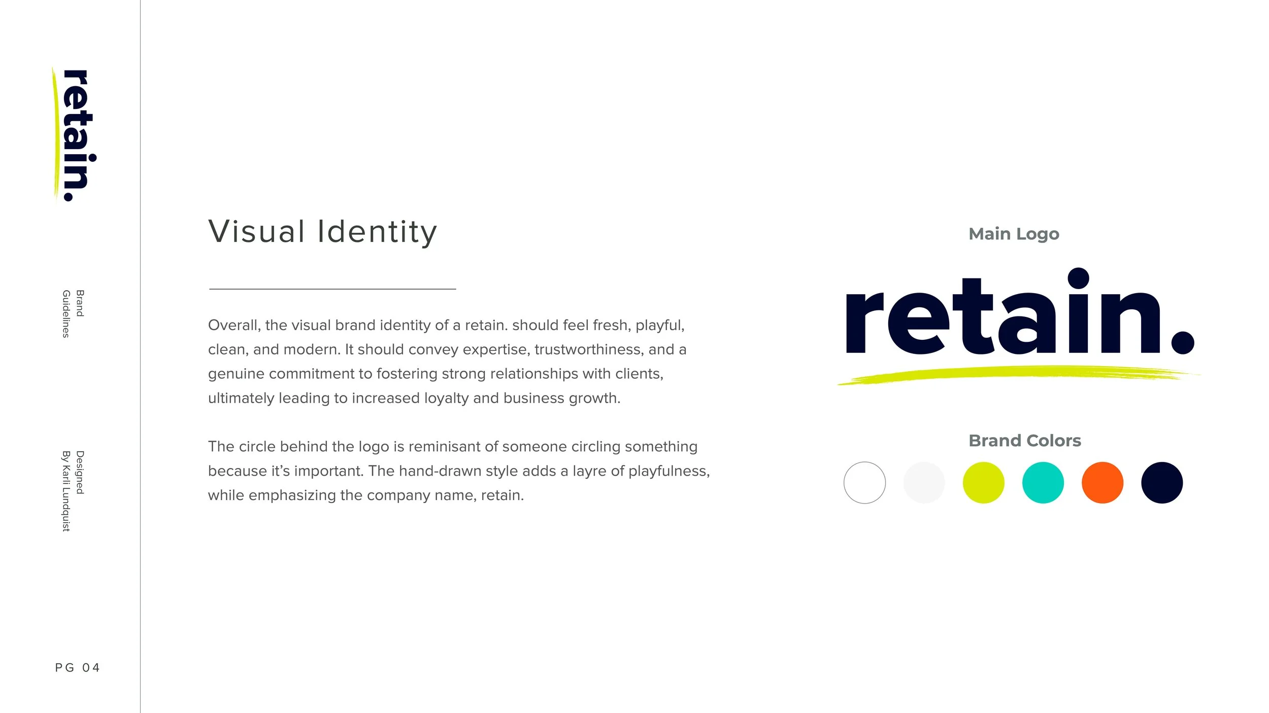
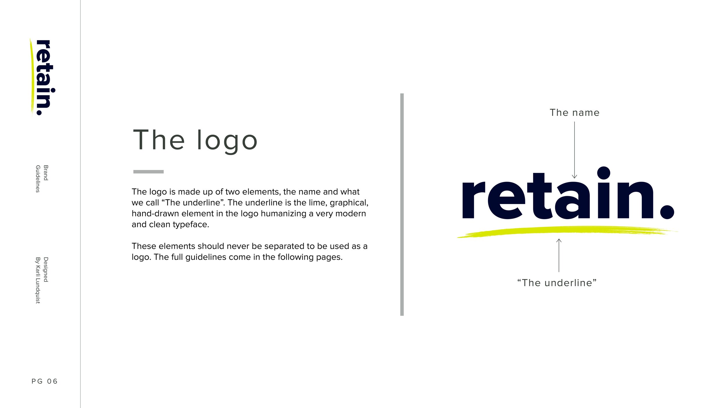
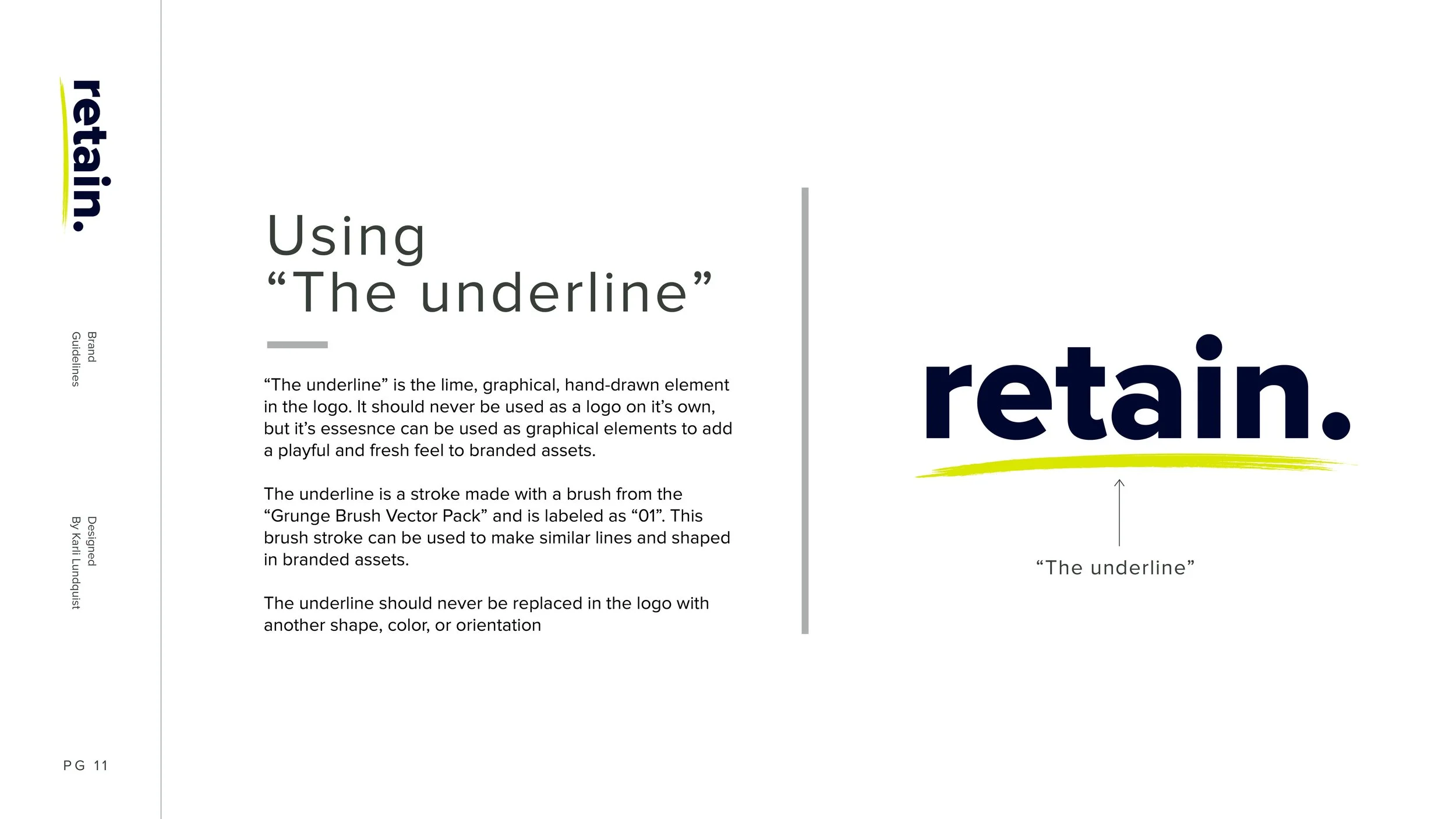
To achieve this, I introduced a hand-drawn underline as a core branding element. This detail brought an organic, human touch to the identity, symbolizing the company’s focus on people. The underline became a versatile component, tying together key visuals while contrasting the rigid, geometric norms of the SaaS sector.
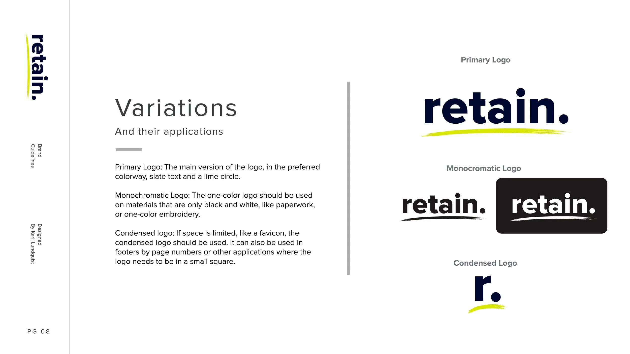
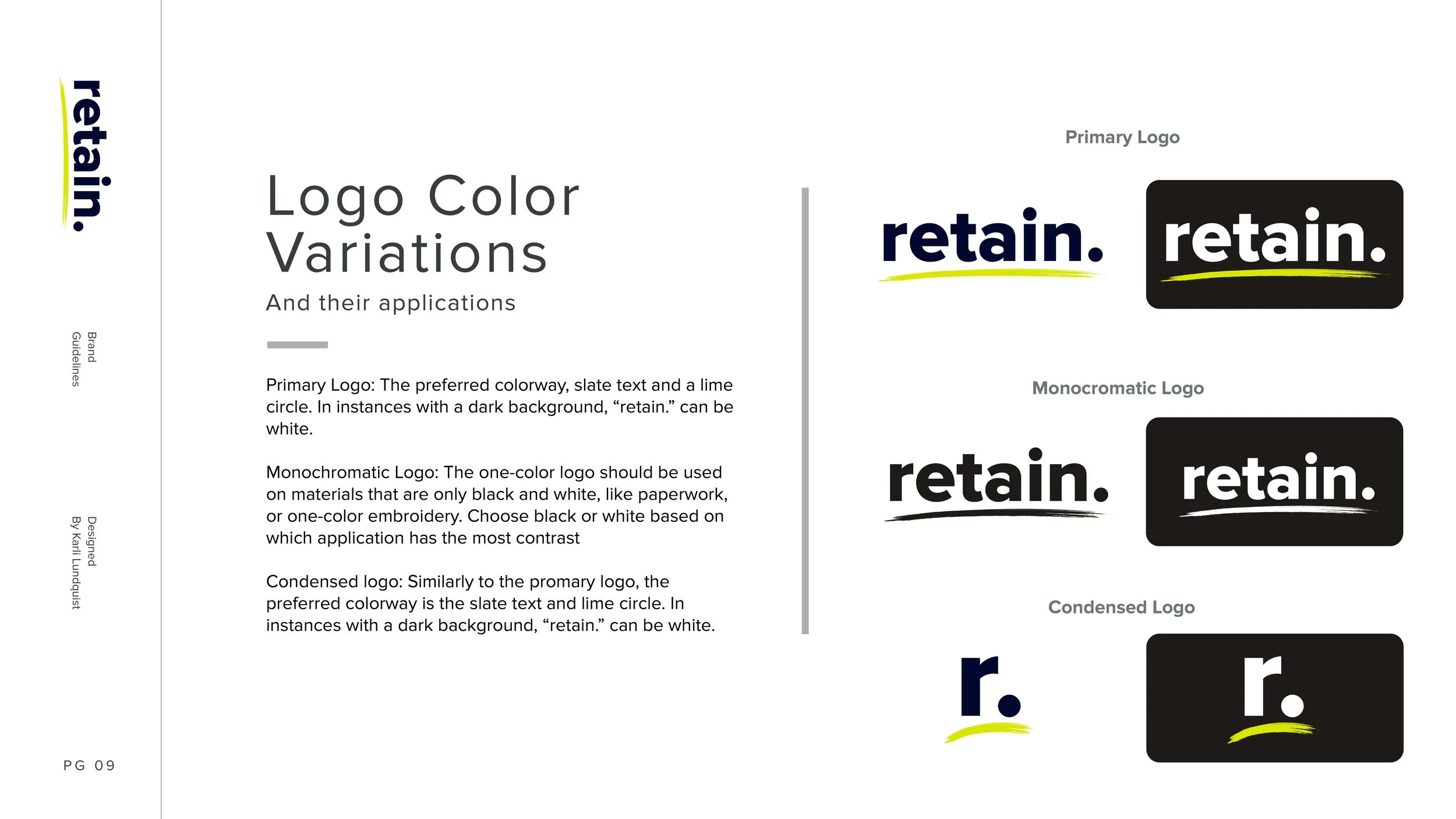
The logo and typography choices followed the same ethos—modern sans-serif fonts were selected for their clarity and professional appearance, balanced by subtle imperfections in secondary design elements to maintain a personal, approachable feel. The color palette was kept fresh and vibrant, leveraging optimistic tones to reflect the positive impact Retain. aims to have on client businesses.
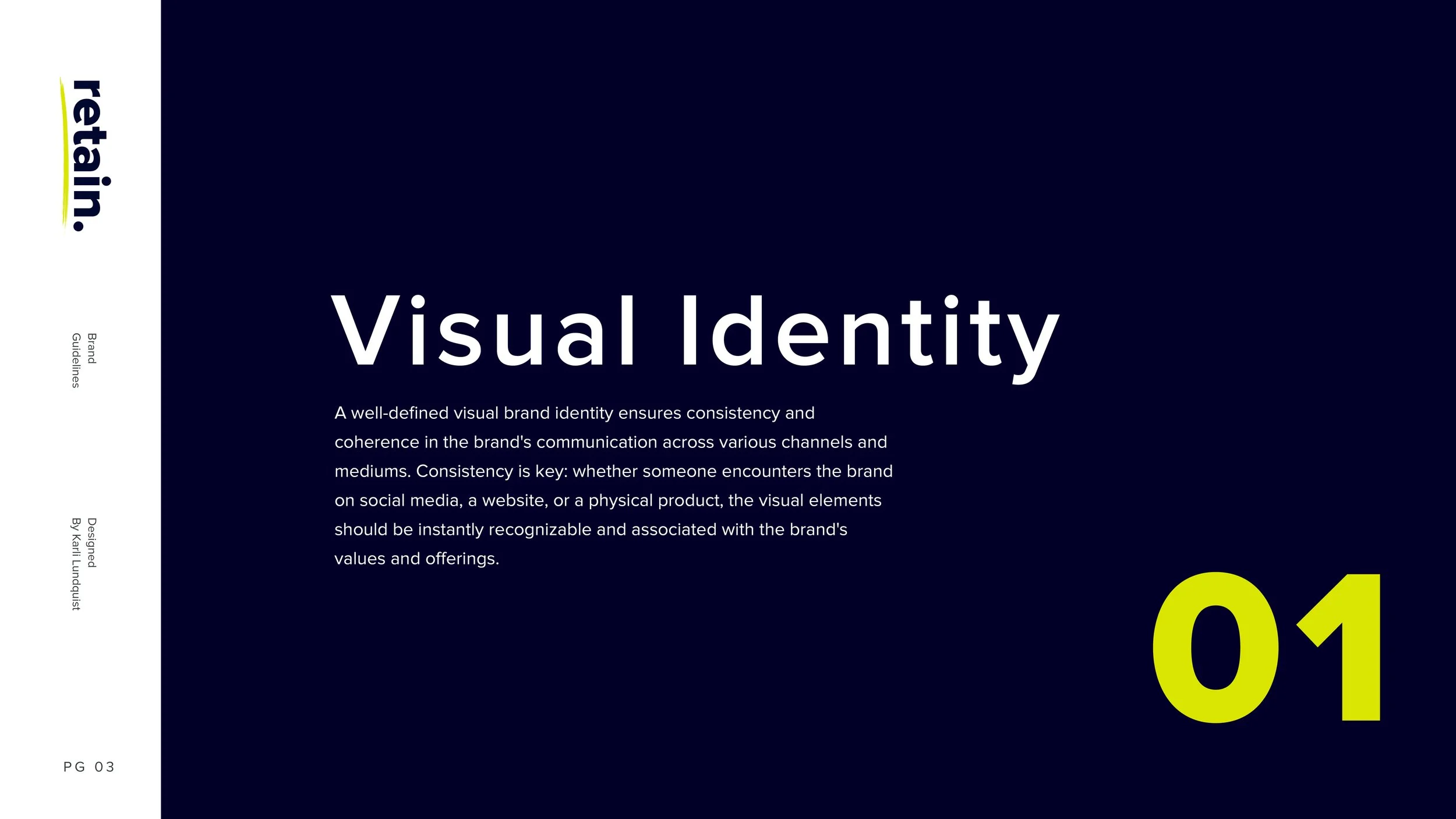
Brand Guidelines